Famous Logos and their Meanings
Recently we came across this interesting infographic website by DesignHill, showcasing some of the world's top brands and their logos, with some background behind their origins. Here are some of our favourites.
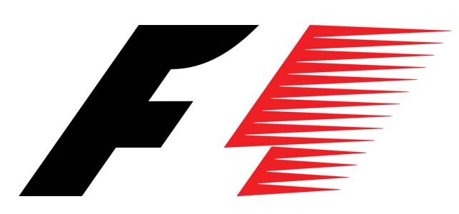
Formular 1
Largely seen as one of the most recognisable brands, the F1 logo uses the negative space in between the two parts to create the '1', while managing to convey the core essence of the brand - speed and efficiency.
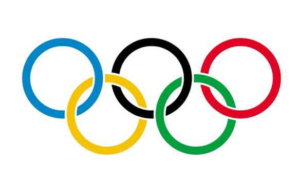
The Olympic Games
Another instantly recognisable brand, the logo for the Olympic Games symbolises the five continents, while the colours represent every participting nation's flag.
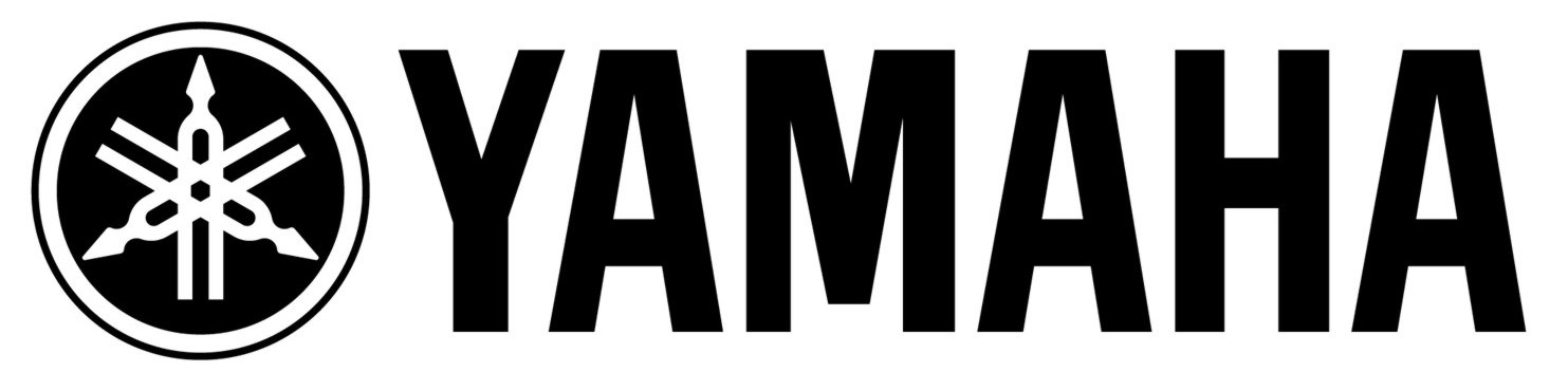
Yamaha
The 'Y' in the logo is actually three tuning forks overlapped, which symbolise effective production, storng sales and modern technology.
Twitter
Although pretty self-explanatory, the Twitter logo was purchased for six dollars from a stock photo library.

Bluetooth
This is one of those names that you'll use regularly but give little thought to where it comes from. The term bluetooth is actually named after King Harald Bluetooth, a Danish monarch well known for uniting Denmark and Norway into one kingdom. The logo is made of the King's initials - H and B - in Nordic runes, to symbolise the connection between two devices, just like the connection between Denmark and Norway.

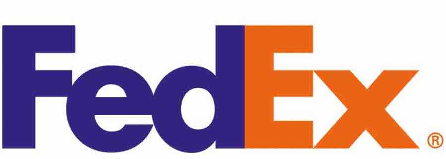
FedEx
Like the Formular 1 logo, FedEx use the negative space in between the 'e' and 'x' to create an arrow to symbolise a package's journey. The font for the logo was created specifically for the logo by Lindon Leader, in order to get the arrow to look right.
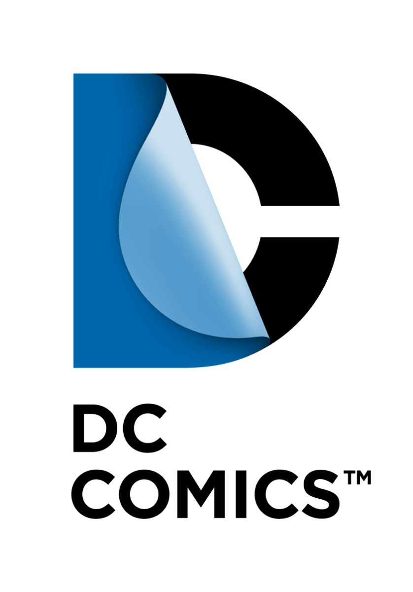
DC Comics
The new DC Comics logo was unveiled in 2012 by brand consulatancy firm Landor Associates. The 'D' is positioned peeled back over the 'C', obviously symbolising turning the pages of a comic.
The Guild of Food Writers (GFW)
A slightly less well known brand, but an interesting one nonetheless. The GFW is dedicated to excellence in food writing, and their logo is a fountain pen tip, with a spoon forming the ink passage.

You can browse dozens more interesting logos and their history over on DesignHill
