How to Correctly Utilise Call-to-Actions
What is a Call-to-Action?
A call-to-action (CTA) is a link or button that you place on your website or e-shot to drive prospective customers to become leads, by taking them to a form. A CTA is the link between the regular, general content – for example on your home page – and a page with a more high value offer on it that is relevant enough for the visitor to complete a short form. When designing and placing a CTA, you need to sit down and think about: What’s the main goal of your site? To sell products? Generate leads? Get sign ups?
If you want to get users to take a specific action, then designing persuasive call-to-action buttons is critical; whether you’re using them on pricing pages, product pages, landing pages, or your blog, well-designed and written CTA buttons are going to help you get more people to do what you want them to do. It’s important for designers and copywriters to work together here; many designers sometimes don’t know what makes a good CTA beyond the visuals, which are obviously important. But with bad copy, there’s little point in even having one.
The size of the call-to-action button is something you need to consider. You want a button that is balanced with content, yet still stands out. It shouldn't be too large or overpowering, but not so small that it gets lost in the content. A good rule of thumb is to look at your current buttons on the page and increase the size of your call-to-action button by about a third, creating a striking button that isn't too in-your-face and overwhelming.
What Should they Say?
Language is hugely powerful and the right copy on your call-to-action can massively impact your conversion rate. Using weak, passive language won’t get you anywhere, so be bold and upfront to tell the visitor what you want, portraying the exact action that is desired. Using action verbs, bold statements and short, sharp phrases is the best way to go. Using language that inspires your users to take action is a good first step. Try and figure out ways to be direct with your visitors and they become a lot likelier to press and take the action you want them to. For example, instead of simply writing “Click Here,” you should try, “Click Here Now”.
Some Good Examples
Netflix
One thing that often deters visitors from signing up for a free trial is being caught unawares and not being able to cancel after the first month - so much so that Amazon had to set up a dedicated service for people to claim back Amazon Prime membership fees that were taken from people unexpectedly. Netflix nips this fear in the bud by makingit clear above the CTA button that you can cancel anytime. The button itself is striking and incorporates the red colour of the Netflix brand.
.jpg)
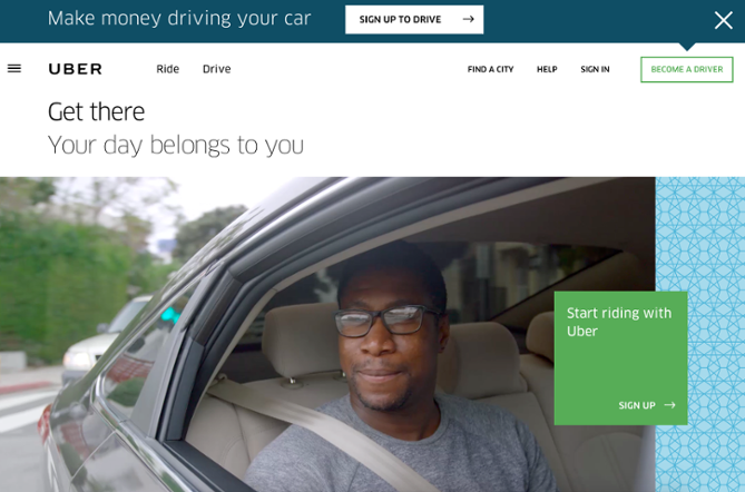
Uber
Uber is looking to entice two distinct types of customer - drivers and passengers. To do this, they've opted for a two-pronged approach by using two different CTAs, since both groups are looking for very different things. The 'sign up to drive' button, white on the blue background, is striking and straight to the point, as is the 'make money driving your car' copy to the left. The large green CTA aimed at passengers is striking and supplemented with a video in the background showing Uber drivers and riders enjoying themselves.
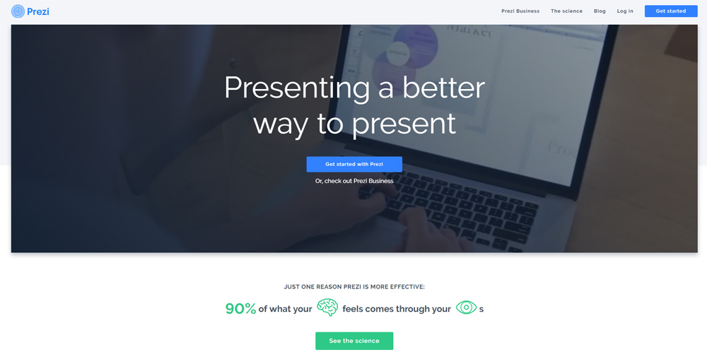
Prezi
Prezi's website utilises a minimalist design, with the primary colour being the bright blue of the logo. The two CTAs with simple messages - 'get started' and 'Give Prezi a try' - both take users to the same pricing page.
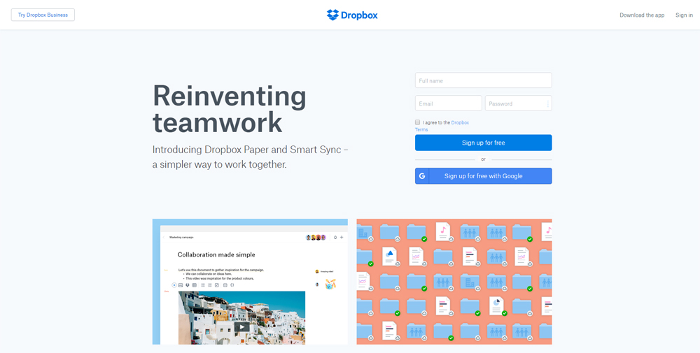
Dropbox
Like Prezi, Dropbox has long embraced a simple, minimalist design for their website, utilising subtle graphics and taking advantage of the negative space. The blue 'sign up for free' button, using the blue colour from the logo, instantly sticks out against the white background. Plus, the word 'free' is always an attention-grabber.