Responsive Design and Mobile Friendliness
A responsive website automatically displays the correct settings that will make web pages viewable and usable according to the device it’s being accessed on. Responsive design sizes your pages, text, and link spacing to fit the size of the screen. Users rely heavily on their devices to find local businesses, so if this is where your business mostly comes from, having a website that displays correctly on mobile devices is even more important.
From a user perspective, searchers will find more relevant information that aligns with their devices' screens. As a business, you will increase your chances of appearing prominently in search results. Google first started promoting responsive design when the mechanic was in its infancy back in 2012, recommending that websites send the same HTML to all devices, and use CSS to change how the page is rendered on each device.
Beginning April 21, Google started to use mobile-friendliness as a ranking signal in search results, and rewarding websites that are fully optimised for mobile platforms. Whereas most changes to the Google Search Algorithm normally have a small impact on search results, Google says the effect of this change will be profound, so it is important for any business owner with a website to act accordingly.
We've been building responsive websites for select clients for the past 18 months, and currently we recommend responsive design to all our new customers. Using Google Analytics to monitor the traffic to all of the websites we've built, we have built a picture of how having a responsive website affects how users interact with your website. The bounce rate - a measure of the users that land on a page of your website but don’t bother visiting any other pages - is a good indicator of how user-friendly your website is. Looking at the figures for mobile and tablets compared to desktop is a quick way to see how mobile-friendly your website is. As well as an increase towards mobile and tablet usage over the past year, we've seen a strong correlation between websites that are responsive and websites that have a low mobile bounce rate compared to desktop.
On the other hand, websites that aren't built responsively tend to have a higher bounce rate on mobiles and tablets than on desktop. Furthermore, we've found that business to customer websites have more mobile and tablet usage than business to business, simply because home users are more likely to use mobile devices than businesses. That isn't to say that if your business primarily deals with other businesses you shouldn't have a responsive website - more and more businesses use tablets, and many people have business emails on their phone.
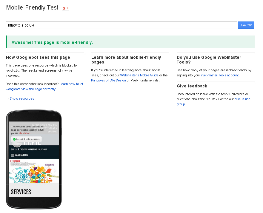
You can find out if your website is mobile-friendly by using Google's Mobile Friendly Test tool, available here. After inputting your URL, the tool will tell you if your website is mobile-friendly or not, and give you a mock-up of how it currently displays on mobile devices.
We're encouraging all our new clients to have their websites built responsively, but if you're one of our existing clients with a non-responsive website, get in touch and we'll provide a free responsive audit.
