#mobilefirst: What is mobile first design?
Most web designers have always approached the desktop side of a design first, leaving the mobile part as a secondary thought. Even in responsive design we work this way, beginning with a full size site before scaling it down for smaller devices. Due to an announcement from Eric Schmidt that Google would begin taking the mobile first approach from now on, there’s a growing trend for designers to flip their way of working around starting with mobile designs before working up to bigger desktop versions.
Mobile isn’t a trend, nor is it even the future, it’s the present. There are over 1.2 billion mobile web users worldwide and in the U.S., 25% of mobile Web users are mobile-only which means that many users will likely only ever see the mobile version of a site. Now more than ever before the web is something that we carry in our pockets and is a global trend that will only continue to grow in the coming years. Although we mustn’t forget that when 25% of mobile users are mobile-only there are still 75% of them who aren’t. Obviously, the desktop is still an important medium, not to be forgotten about quite yet!
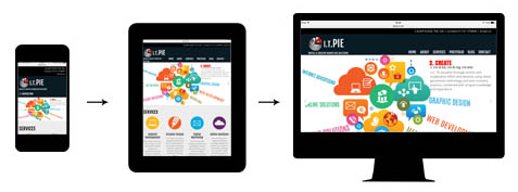
‘Mobile First’ prioritises the appearance and accessibility of web content on mobile devices like smartphones and tablets. This means that a designer starts by creating a simple mobile version holding only the bare essentials of a site before gradually adding features as they work up designing for larger platforms. This means as a designer, you’ve already gone through the problem of trimming down the content to its most vital elements meaning that when it’s time to bring the design to desktop you can then decide how to make it more robust. As the need arises, the site can gradually be “enhanced” and even completely rethought for larger platforms that have fewer constraints.
Since this new trend has come about there have been many debates between designers who love this new approach and designers who prefer their original way of designing. Both methods have pros and cons which suit different designers’ styles. Some designers might prefer starting with the basics before gradually adding features and enhancing their design as they build up towards desktop. Others prefer to let their creativity run wild designing a full size site before then working out how to scale it down into a simplified design for mobile use.
The importance of mobile design varies depending on your target audience. Programs such as google analytics can help you to discover important attributes of your audiences such as whether they access your site through desktop computers or mobile devices. From this you can decide which platform is most important for your brand and therefore plan whether to design traditionally or embrace this new ‘mobile first’ approach. Although mobile design is becoming increasingly important, desktop use is still high meaning it is just as important in today’s world.
